Final reflection
Write one sentence about your strongest edit.
Finish with one sentence: “The edit that made the biggest difference was ___ because ___.”
Capstone project
Apply the full path to a simple event poster so one message reads first and the rest supports it.
Redesign one small event poster end-to-end. You do not need new tools or new assets — the goal is to use every principle from the path on the same piece.
Principles you will apply
Starting material
The starting card has a title, date, description, and an action — but every element is competing. Your job is not to redraw it; it is to make decisions about what should lead.
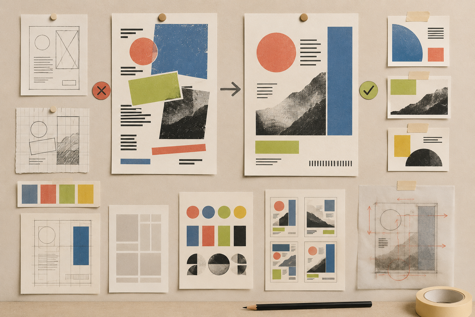
Studio workflow
Work top to bottom. Each step should take two to four minutes. Do not jump back to polish until the last step.
Pick the one line the viewer must read first. Everything else is supporting.
Place date, location, and description into a tight chunk separated from the headline and the action.
Give the headline real size, keep the supporting line smaller, and set body text to one calm size.
Use a neutral base, dark ink text, and one accent color for the action. Cut every other accent.
Decide where the eye starts, where it pauses, and where it lands. Align everything to one structure.
Delete decorative chips, duplicate labels, and competing accents. Keep only what helps the message.
Walk the principle checklist below before calling it done. Edit one more thing if any item still feels off.
Principle checklist
Walk each item with the squint test or the three-second test from earlier lessons. This is a static reference — there is no saved state.
Self-review rubric
Pick the closest level for each area. You do not need to score yourself — you need to know where the next edit lives.
| Area | Needs work | Clearer | Strong |
|---|---|---|---|
| Hierarchy | No element clearly leads. The eye still searches. | One element leads, but supporting parts are close in weight. | The first read, second read, and action are all obvious. |
| Spacing | Most gaps look the same, so nothing reads as a group. | Some groups are clear, but a few boundaries blur. | Related items sit close, unrelated chunks have visible breathing room. |
| Typography | Multiple sizes or weights compete for the same role. | Three or four roles are visible, with one or two near-duplicates. | Each line has a distinct role and a comfortable size. |
| Color | Several accents fight for attention. | One accent leads, but a second still competes in a small area. | A calm neutral base and one accent doing one job. |
| Layout | Elements drift off any visible structure. | Most items align, but one or two break the structure without a reason. | A clear focal area, an aligned supporting group, and an intentional action position. |
| Editing | Decorations were added to fix confusion that deletion would solve. | Most decoration is justified, with one or two leftover ornaments. | Every remaining element earns its place. |
Final reflection
Finish with one sentence: “The edit that made the biggest difference was ___ because ___.”
Reference shelf
Keep before/after examples, lesson notes, and patterns you want to reuse when you design your own work.
Capstone ready
This is a static MVP preview, so completion is not saved. The studio is here whenever you want to apply the path to a new piece.
No real progress is tracked. Capstone state is illustrative only.
Lesson-aware studio coach
The studio coach is scoped to hints, explanations, and rubric questions. It helps you make the decision instead of replacing it.
Sample response
Start with the first read. Name what should be seen first, then reduce competing weight on everything else.
Reference shelf